Renewable energy convergence support
Designing the field-work screens missing from a REMS system built around programme requirements.
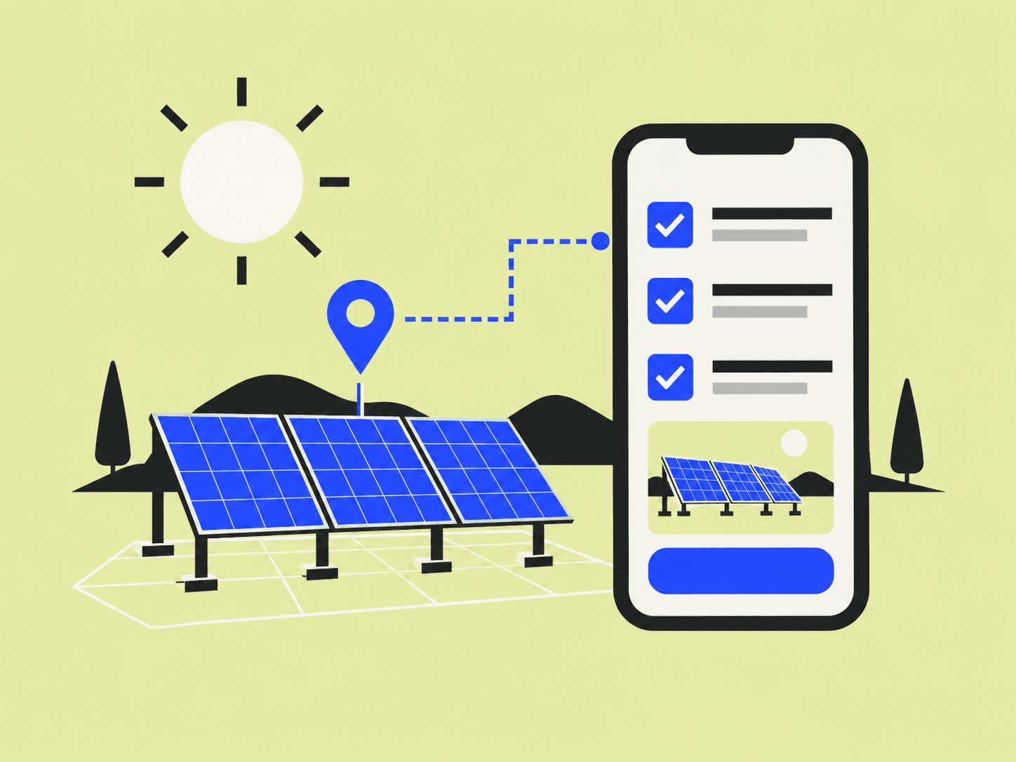
Background
Korea's renewable energy convergence programme supports the installation of several types of renewable equipment across a district. Local-government staff administer the programme, while field engineers carry out installations. This project began with a gap in the existing REMS system—the screens needed to support their day-to-day work were missing or insufficient. The work presented here focuses on the field engineer's mobile workflow. It is a prototype for reviewing that workflow; equipment connection and submission are simulated, and field records are not retained on a server.
- Role
- Project Manager / Service Designer
- Team
- Worked with frontend and backend engineers
- Organisation
- Korea Institute of Green Climate Technology
- Timeline
- December 2025
- Tools
- Figma · AI-Figma MCP · React + Vite mobile prototype
Outcomes
- A mobile installer journey from finding a site through equipment connection, work records and submission
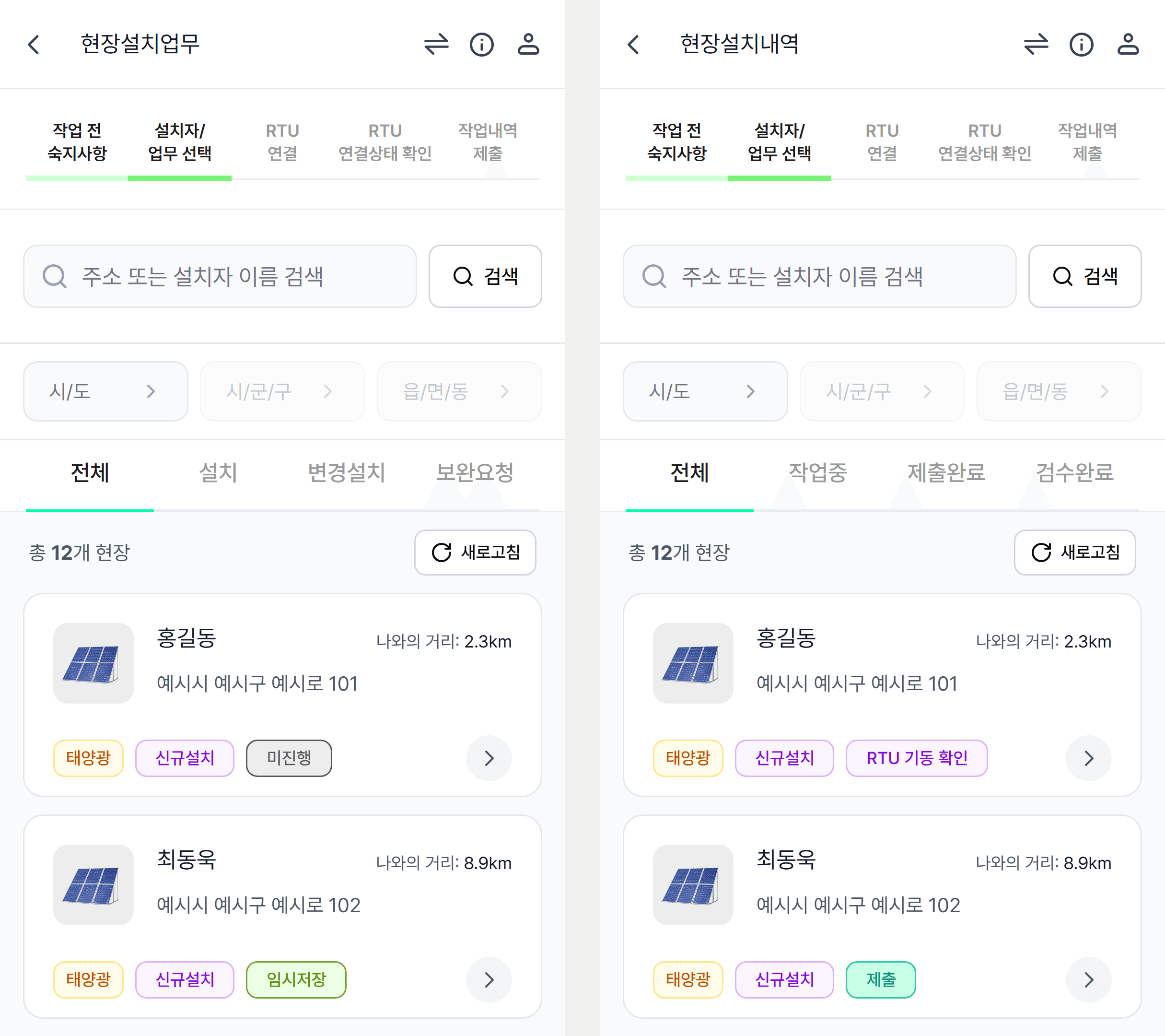
- Distinct views of assigned work and installation records, with site search by region and work status
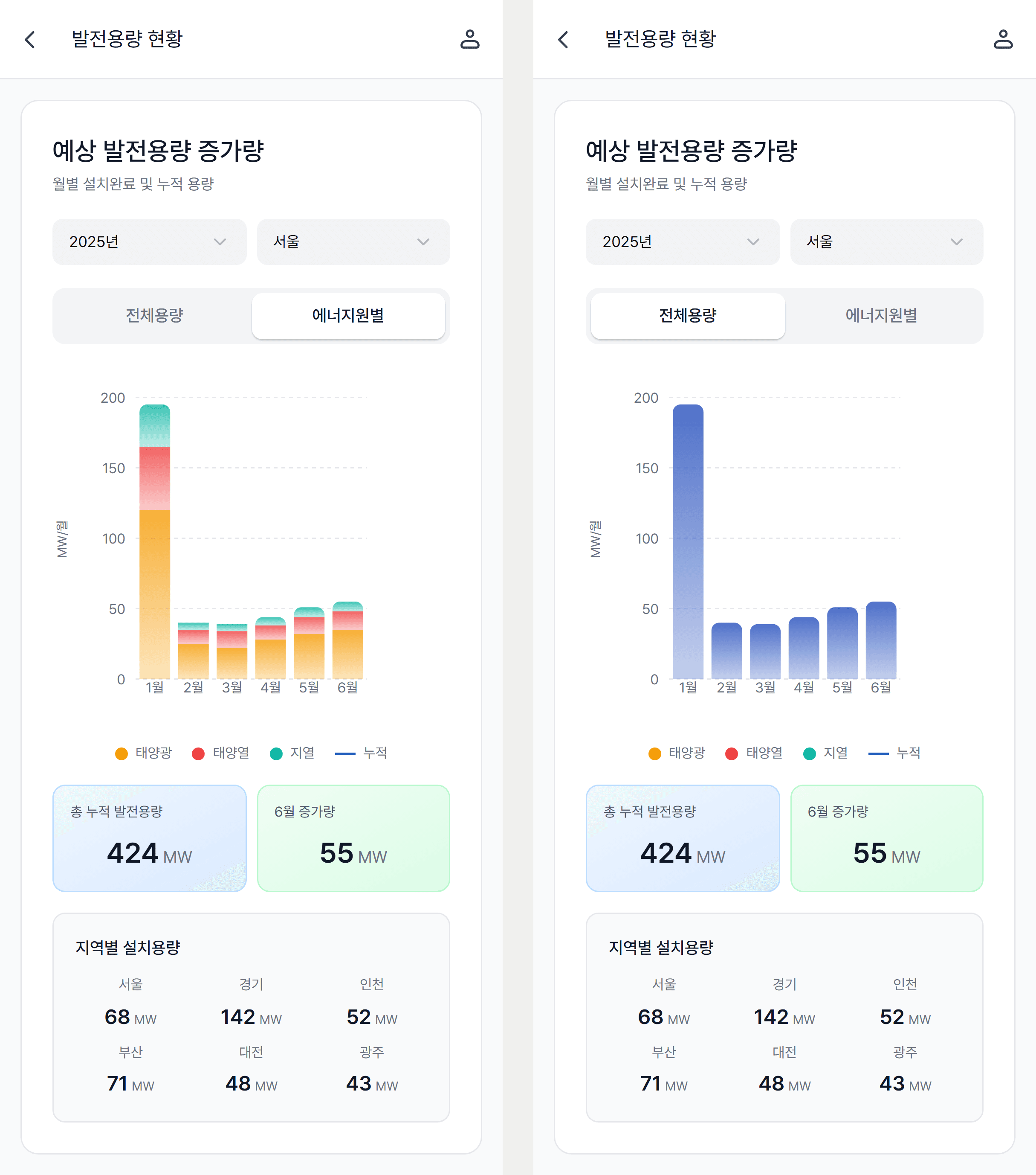
- A capacity-status chart screen that switches monthly growth between by-source and total views, with cumulative and regional summaries
The problem
At the time, REMS was organized primarily around the programme's institutional requirements. The screens that local-government staff and installation engineers needed for their daily work were not adequately provided. Having the information a programme requires did not, by itself, give its users a way to act on that information and complete their next task.
Field engineers needed to find their assigned sites, understand the work to be done, and move through equipment connection and recording the installation. I made that installer journey the concrete design scope. The wider problem concerned both local-government and field users; the deliverable shown here is the mobile prototype for field installers.
How I approached it
I reviewed the specification with internal stakeholders and organized the actions an installer needed to perform. Finding a site, connecting the remote telemetry unit, recording work photos and submitting the installation record became one sequence, with the information and next action made visible at each stage.
I treated the site list as the starting point for finding the work that needed attention. Name and address search, region filters and work categories narrowed the selection. Separate assigned-work and installation-record views let the installer inspect upcoming tasks and existing records for their different purposes.
I connected the journey into a prototype that could be used on a phone. The specification and running screens could then be reviewed together to examine whether a relevant site could be found, whether the current stage and next action were understandable, and whether the recording sequence held together.
Questions the field-work screens needed to answer
The detailed interactions followed the questions an installer would need to answer while working.
- How far have I progressed? Completed and current stages follow a consistent visual rule so the next step can be understood.
- What needs doing at this site? The work list shows task categories and status, while the installation-record view keeps its own status information.
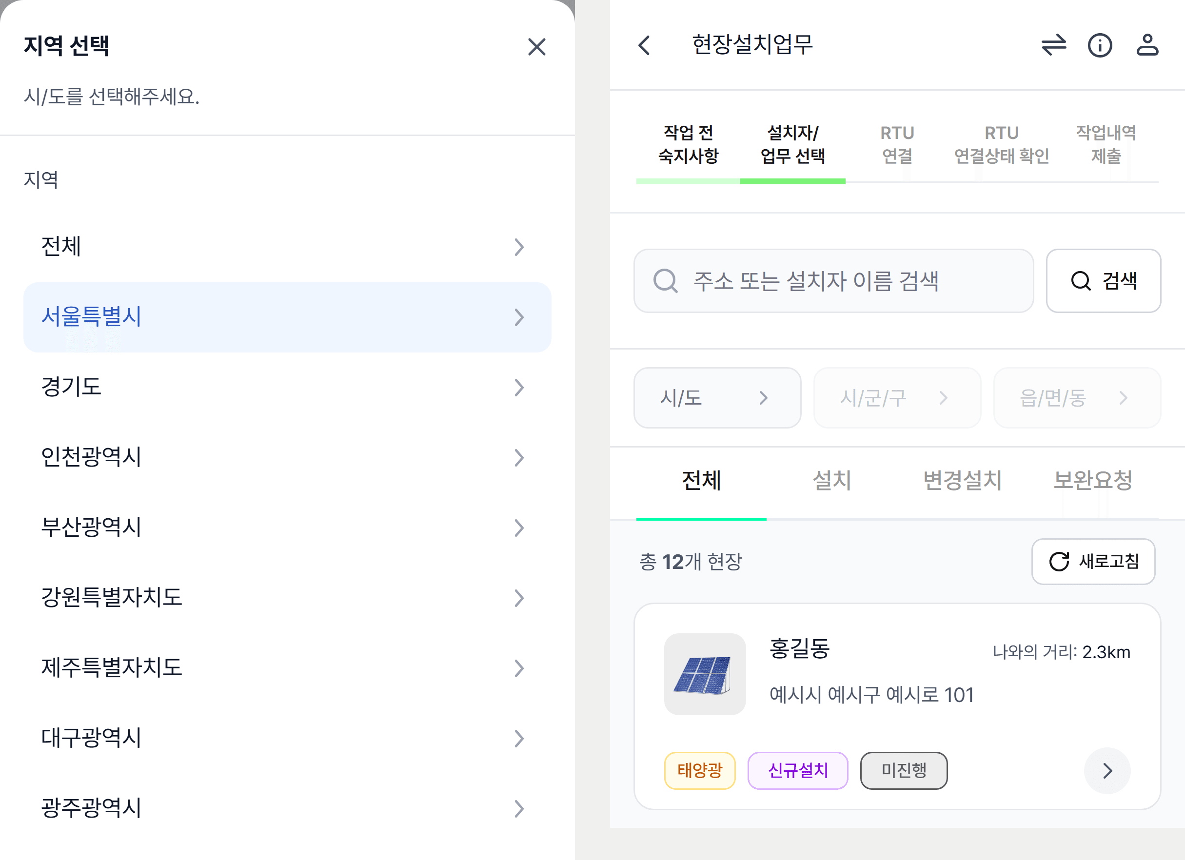
- How do I find sites in another area? Alongside narrowing the region selection, an All option provides a way to clear it and browse again.
I recorded these decisions and their reasoning for the developer handoff. That made it possible to share how the screens should respond when work status or a user's selection changed, alongside their visual composition.
Reading the accumulated records as a status view
Each record an installer submits from a site is one piece of work. Together they become the numbers that say how far the programme has progressed. The capacity-status screen in the member-services menu is where those numbers are read. I organized it around three questions on one screen. How much was added this month is answered by the monthly bar chart, how much so far by the cumulative-capacity and latest-month tiles, and where it concentrates by the regional capacity grid.
The central decision in the chart is the toggle between by-source and total capacity. The convergence programme installs several kinds of equipment together, so whoever reads the status needs to alternate between which source drove the increase and how large the whole is. Rather than two separate screens, the same bars either stack or merge. The year and region filters sit on the same card so that changing the conditions does not change how the chart is read.
The outcome
The installer workflow missing from the existing REMS experience took shape as a mobile prototype, from finding a site to submitting a work record. Stakeholders and developers could examine the installer's next actions and working sequence on the same screens. The deliverable demonstrated a direction for translating programme requirements into the interfaces people need to do their work.
From programme requirements to the installer's workflow
Process
Identify the gap between programme requirements and daily work
I framed the problem as the lack of working interfaces for local-government staff and field engineers in a REMS system centered on institutional requirements. I focused the design scope on the installer's mobile tasks and reviewed the necessary sequence with internal stakeholders.
Connect the information an installer needs with the next action
I organized the journey from finding a site through equipment connection, work photos and record submission. Search and region filters supported finding the relevant site, while separate work and record views served the different needs of identifying tasks and reviewing existing records.
Make the workflow available for review and handoff
The mobile prototype made search, region selection and clearing, and movement between stages available to try. I handed over the specification, running screens and reasoning behind detailed decisions so developers could discuss them in the context of the installer's work.
Result
The design made the installer's mobile workflow concrete: finding the required information and moving into the next task. It gave stakeholders and developers a shared prototype for reviewing both page composition and the working sequence.
What I took from this work
The information structure required by a programme and the interfaces needed by its users have to be designed together. Considering who needs information, in what circumstances, for which decision and next action helped translate the programme's procedures into a working experience. This project gave me a way to reconsider system structure through the tasks of each role.
G-SEED and emissions target management: a shared design approach
The two programs keep their own procedures. Both designs make the sequence visible, define what allows work to move forward, and attach decisions and records to the case they belong to.
G-SEED green building certification
- Sequence of work
- Application
- Receipt
- Self-assessment
- Fee
- Document correction
- Site inspection
- Evaluation result
- Certificate issuance
- Conditions for moving forward
- Each stage becomes available when its data exists. Document correction returns to self-assessment so the review can continue.
- Records that remain
- Stage information, attachment metadata and correction records stay with the application, alongside its certification progress.
Emissions target management
- Sequence of work
- Selection and distribution
- Completion and submission
- Receipt, review and correction
- Confirmation
- Agency sharing
- Response and change management
- Conditions for moving forward
- Receipt, correction and confirmation follow one shared procedure. Only confirmed surveys can enter a file shared with the agency.
- Records that remain
- Decisions and evidence stay with each survey, with separate records of generating, delivering and acknowledging the shared file.